If you haven’t noticed, Google has been revamping their look. Unifying the feel of all their sites. So far, I like it, with my only real complaint being the over abundance of white space. Luckily, most of the apps offer the ability to select a “compact” look that eliminates much of that, squeezing everything in closer together. These days, I prefer whenever possible to hang out over on Google+ instead of Facebook, largely because of its much cleaner look and lack of crap I don’t like.
But all isn’t roses in the land of search and honey. Google’s latest moves have started to bother me. The first being the new YouTube. The pages for any individual video is much improved. It’s cleaner, nicer, and with the new size buttons of regular, large and full screen, it simplifies in all the best possible ways. Which makes the atrocity of their main page such a disheartening failure. I used to be able to quickly review my subscriptions while scrolling, but now, with one or two prolific video posters (I’m looking at you machinima!) my front page is pretty just one or two people, with the odd other video thrown in. Maybe it’ll grow on me, but I don’t see how.
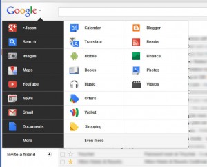
Rolling out to select people now but eventually to everyone is the new Google Bar. Not one of those you install on your browser, but that black bar that has existed at the top of the majority of Google pages for a while now. A short while ago, probably prepping for the new bar, they juggled the apps around. Now that you can see the new design, the reorder of the apps remains. I’m certain that somewhere is a guy at Google who has lots of metrics that informed on which apps made the cut of being on the first level and which ones got hidden behind the “more” entry, at least I hope there is so that I have someone to properly hate.

You see, one of the apps I use all the time is Google Reader (RSS feeds are awesome!) and when they performed their juggling act, Reader dropped off the main app selection. And with this latest revision, Calendar didn’t make the cut. It’s just insanity that Google hasn’t yet, even back in the black bar days, implemented a way to let each user decide the order of apps.
The new prime apps are Google+, Search, Images, Maps, YouTube, News, Gmail and Documents. To begin with I use Google+ a bunch, probably keep it open most of the day. Next I literally cannot recall the last time I when to the Search main page with the intent to search. I go there to see the new logos. (To be fair, I use Bing now for searching just because I earn points that I can spend on Xbox Live spacebucks, so when I used the Chrome address bar to search it goes to Bing, but before that it used Google, and I still can by typing “g” and a space then my search query.) Same with Images, since it’s basically search – I usually just do a regular web search (from the address bar) and then click the image link on the left of the results. Or, you know, I type “i” followed by a space in the address bar, which is my short cut to image searches at Google. I use maps, but not very often. I do use YouTube quite a bit. News works like Search and Images, “n” followed by a space in the address bar. Gmail and Documents are both deserving. So of the 8, I’ve identified 4 that could easily move beneath the “more” and I’d barely notice.
Meanwhile, I use Music every couple of days, Calendar daily, and Reader I use easily 4 or 5 times a day. And yet, with the new design, I have to click the Google icon on the new bar, then hover over the “More” entry and then select my app. Or I ignore the menu altogether just use the address bar to pull up the site. Maybe I’m just not the target audience. I don’t know.
Anyway, enough rambling out of me, though I do hope they allow for some customization soon.